INFO
EN
CZ
This content is © Jan Herynek, 2025.
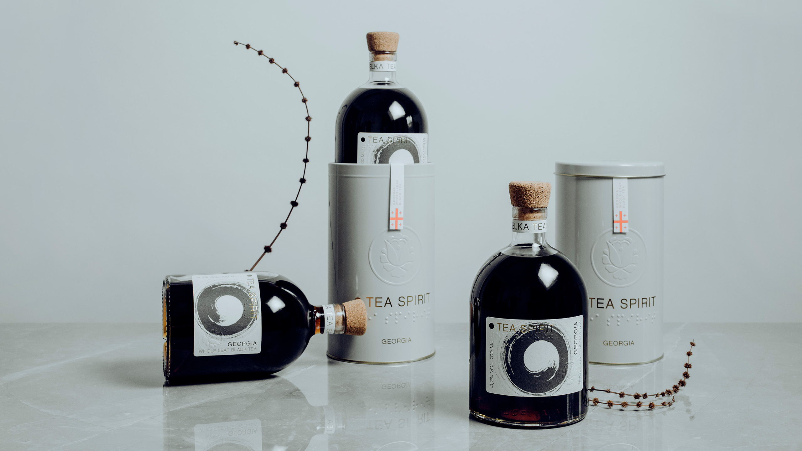
Tea Spirit
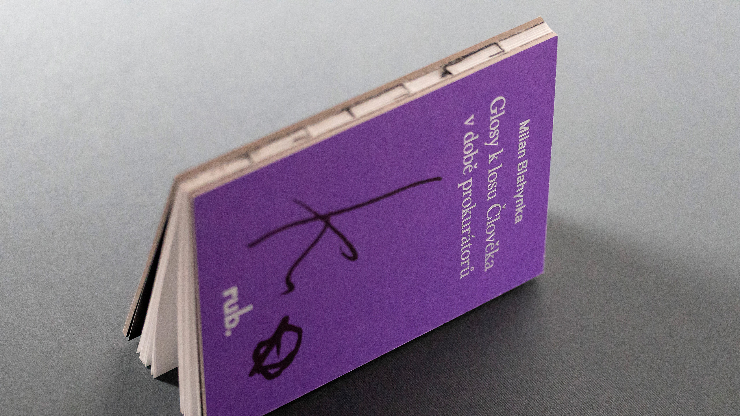
rub. edition
Next Project
See More
Design Herynek
Design Herynek