INFO
EN
CZ
This content is © Jan Herynek, 2025.
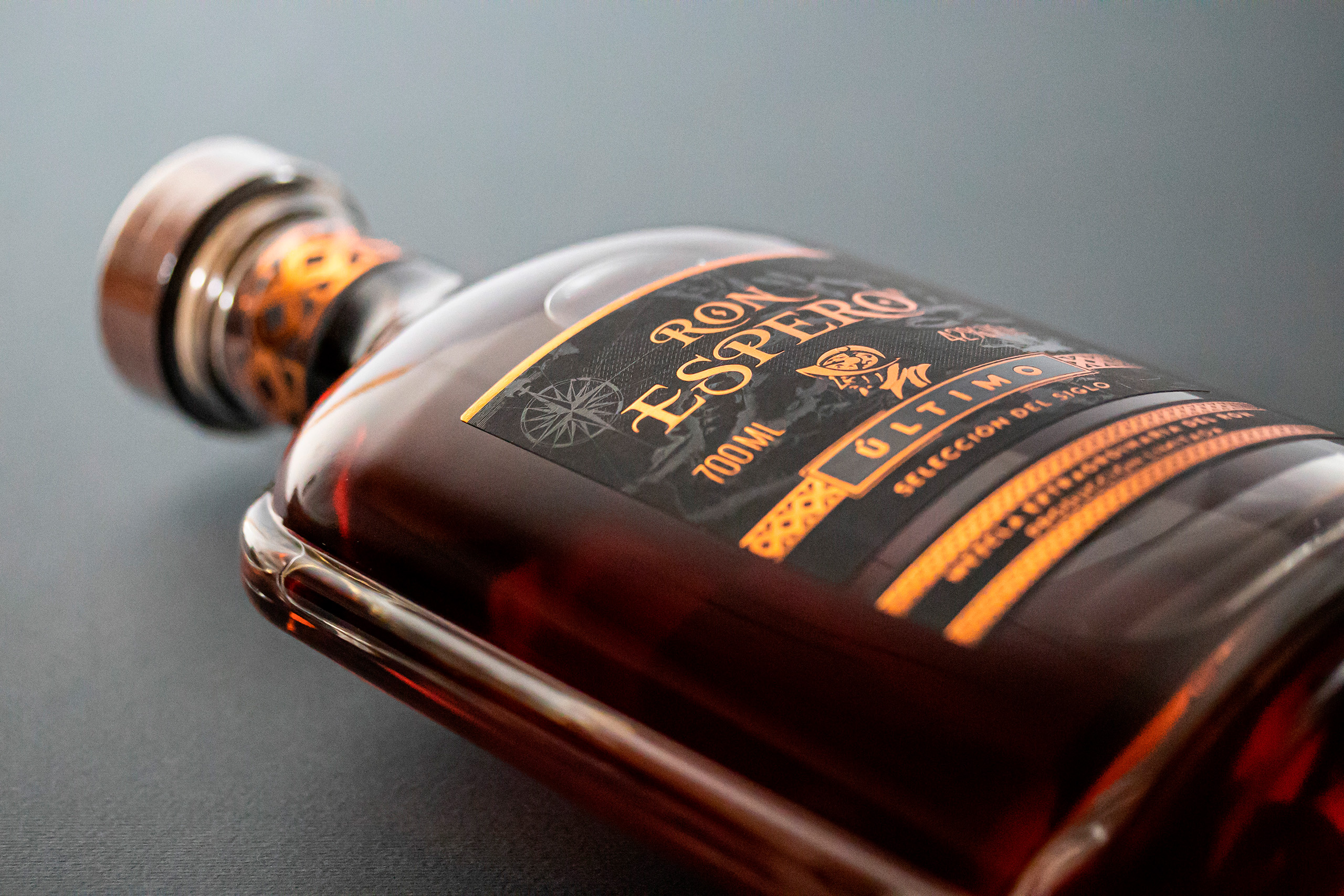
Ron Espero Último
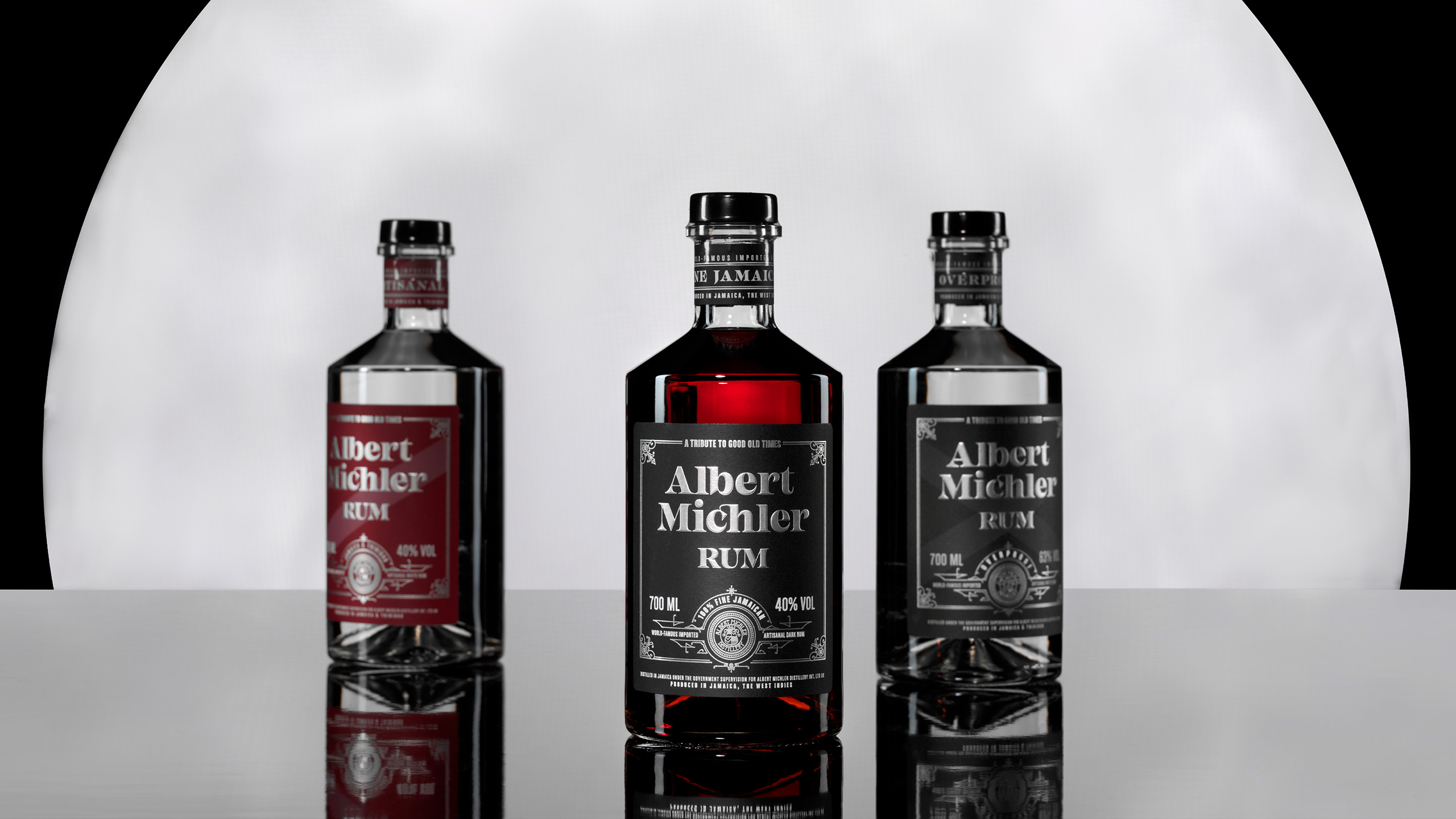
Albert Michler Rum
Next Project
See More
Design Herynek
Design Herynek