INFO
EN
CZ
This content is © Jan Herynek, 2025.
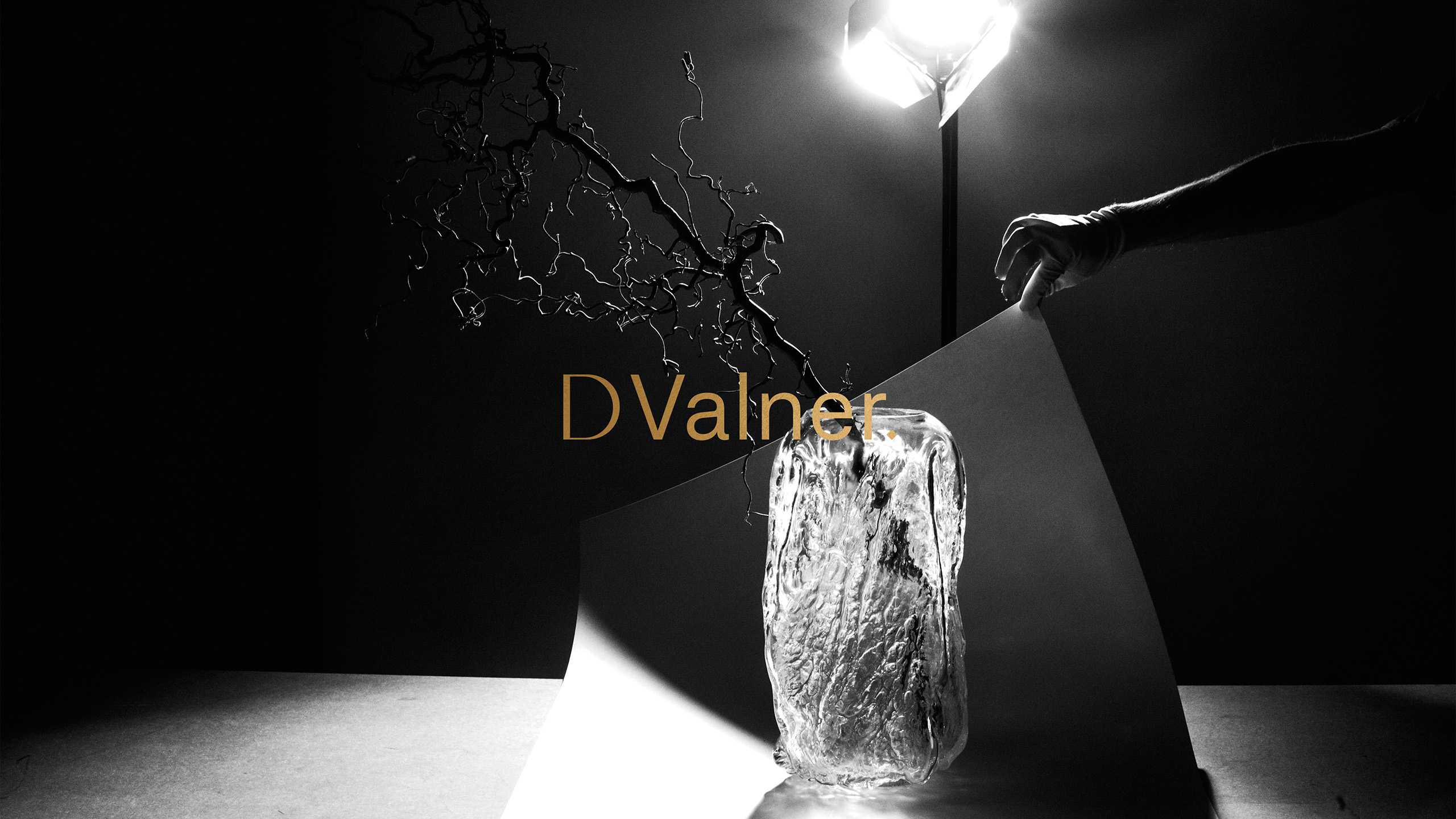
Designer David Valner
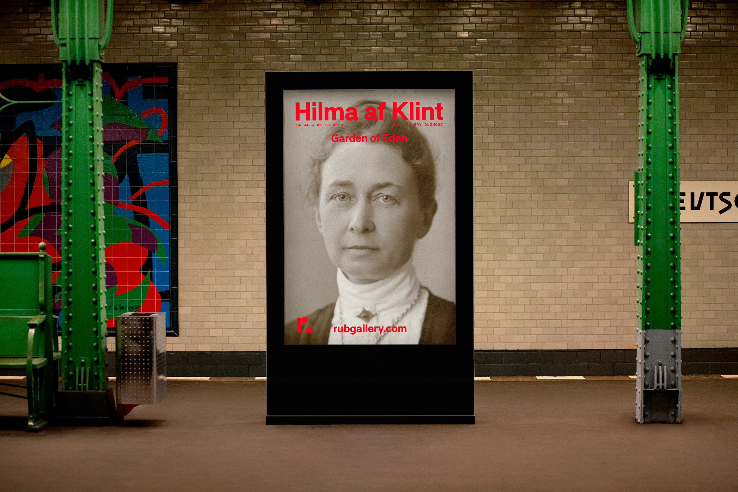
Rub Gallery
Next Project
See More
Design Herynek
Design Herynek