INFO
EN
CZ
This content is © Jan Herynek, 2025.
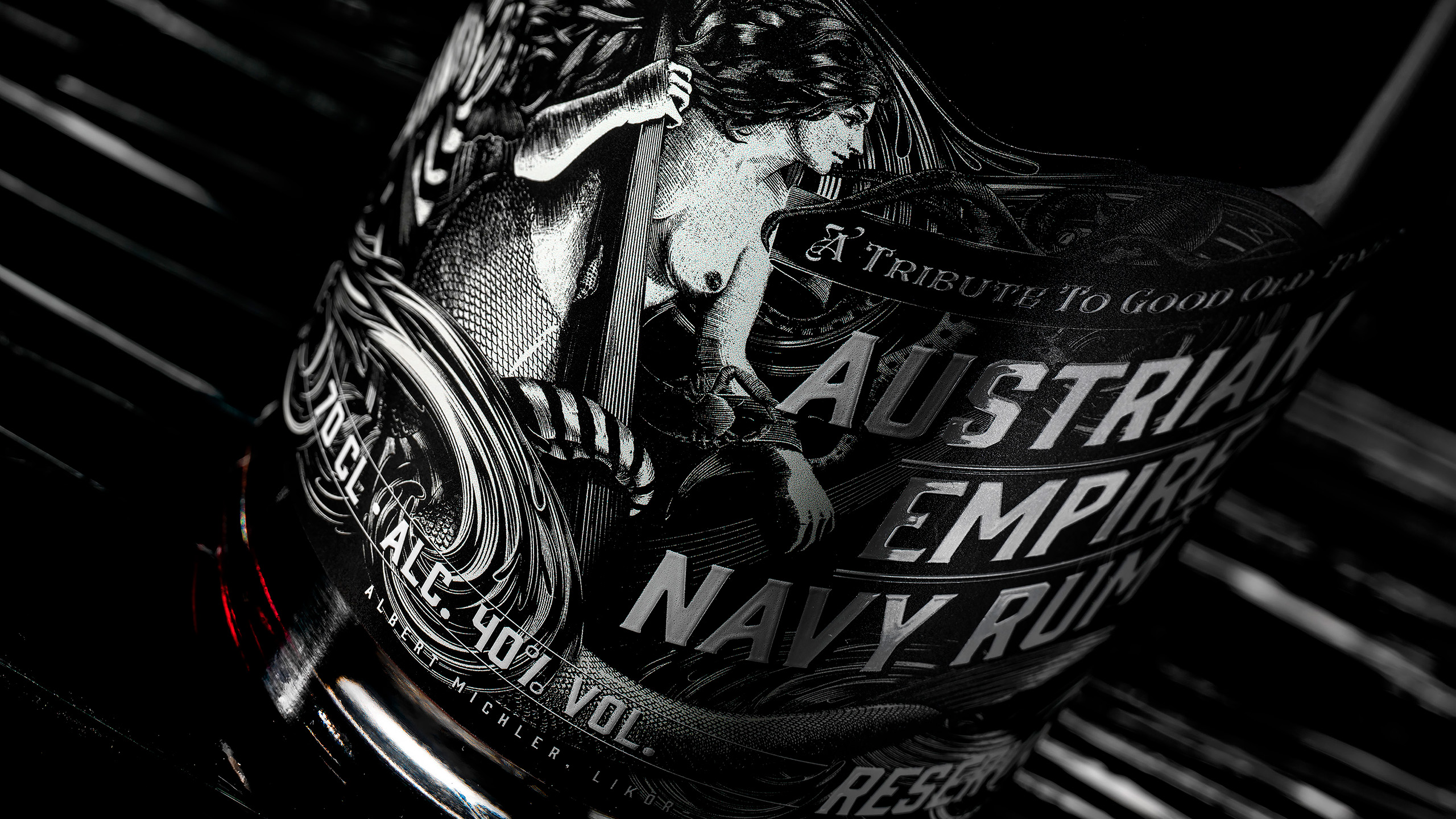
Austrian Empire Navy Rum
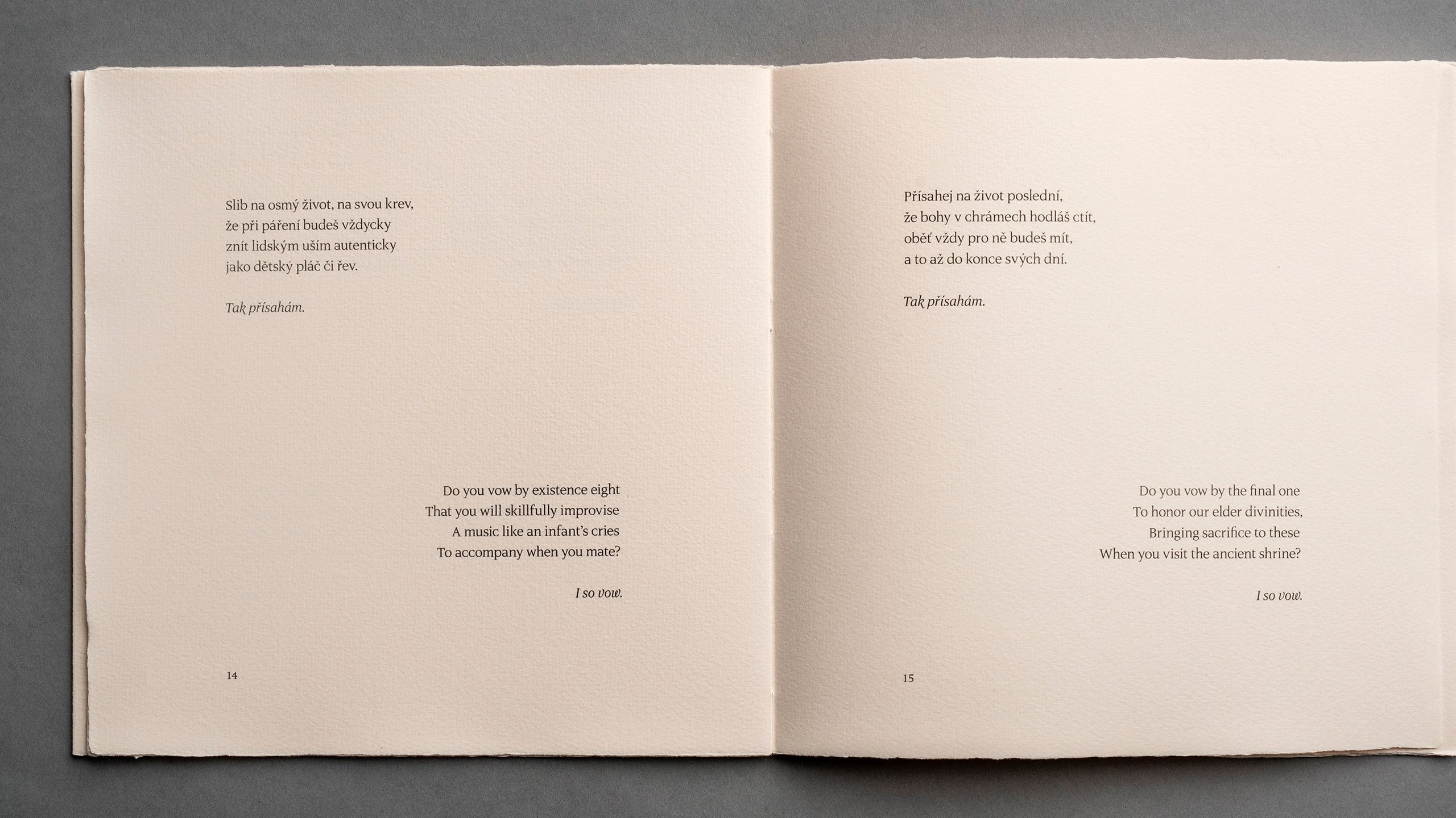
Fred Chappell: Kočičí přísaha
Next Project
See More
Design Herynek
Design Herynek